DC Lo-Fi
— Posted on 19 February 2014 | 2:24 am

A new show from DC-based photographer Michael K. Wilkinson, “DC Lo-Fi,” seeks to capitalize on two points of familiarity to many city residents: urban vignettes focused on the disappearing signs of an ever-aging yet ever-changing city, and the ubiquitous square format of Instagram with its instantly recognizable filters.
The photographer, a Washington DC resident for over 20 years, has selected a range of scenes for the show, some of which would be recognized by astute observers of the city, and others which just resonate with a certain locationless urban sensibility.
“Part of the poignancy of the project, for me,” Wilkinson says, “is the fact that, as a professional photographer, I’m no longer using film, or even my digital SLR for that matter, to express myself artistically. Instead, I yank the iPhone out of my pocket and snap things I see as I’m walking around the city, then throw a couple images into Instagram, which cross-posts to flickr, Tumblr and Facebook. Within seconds, the feedback starts to roll in, one ‘ding’ at a time.
"In the age of the mobile device, you accomplish In a matter of minutes what it used to take weeks or even months to do when we shot on film, printed in darkrooms and hustled for gallery shows.”
Printed on ultra-high gloss metal surfaces ranging in size from 8x8 to 30x30 inches, the images in the show bridge the gap gorgeously between the ephemeral “social-digital” format and the permanence of a piece of art on the walls. Both the subject matter and the medium will strike viewers with a particularly strong currency and resonance, hitting nerves on both a new/hi-gloss-modern-mobile-culture level and a gritty, fast-disappearing urban-pioneer level.
Michael K. Wilkinson (mkw1.com) is an architectural photographer based in Washington DC. He has participated in over 30 one-man and group shows over the past 20 years. He has been an avid iPhone photographer since the day his carrier, Verizon, began offering the device on its network, but is and will always be amazed that he can take photographs with a telephone.
staged. framed. shot.
— Posted on 24 December 2013 | 2:48 am
I was asked in early 2010 to contribute a favorite photograph to AIA|DC’s monthly newsletter, with an explanation as to why it was a favorite. Now that I’ve got a fancy new website, I thought I’d republish the essay on my blog.
While I originally decided to post the thing because I think everything I wrote then pretty much still holds true, re-typing it has made me realize that the 2007 assignment from which my chosen photograph came actually marked an important turning point in my work.
“Photographer’s Corner,” AIA|DCnews, April 2010.
“This is one of my favorite shots because it addresses the biggest challenge of working on single-family renovations for small and sole-practitioner architectural design firms: matching architects’ lofty design intents with the often mundane reality on the ground after the job is finished.
"In working for small firms, two things often come into play to foil the achievement of portfolio-quality photographs on a completed design: Margins on the job are tight so there isn’t much money left for staging, if any. And, the family has likely spent all of their available resources on the renovation, having to defer the purchase of design-compatible furniture and artwork and leaving us with a mishmash of pre-renovation art and furniture to work with.
"In this assignment, a lifelong resident of mid-century Carderock Springs MD has purchased a home near the one he grew up in and commissioned Bethesda-based architect Douglas Soe Lin to design an addition and open up the existing interior space. While much of the family’s furniture was left over from their newlywed days (and some even from college), they had begun to purchase a few more modern pieces of furniture before the renovation.
"Since the family was using this room as an informal space for watching TV, paying bills and playing with the kids, they had gathered most of their old furniture in here, diminishing the dramatic effect of the new built-in cabinets and the three-quarter height dividing wall. We imported the more formal modern sofa from the living room, positioned a vintage armchair and ottoman from another room to add interest to the foreground, and removed the computer from the new built-in desk at the rear of the room.
"The net effect of the changes was to transform a ‘snapshot room’ into a portfolio scene that highlights the architect’s design intent, without taking too much time or spending inordinately on staging - keys to working successfully for small architectural design firms.
"As an added bonus, the family liked the change so much that they decided to keep the arrangement, further solidifying the architect’s relationship with them as a design adviser for the long term.”
* * *
Nearly four years on from when I originally wrote that essay, it’s now clear that the Soe Lin assignment at Carderock Springs marked something of a turning point in my work.
Prior to that assignment, I photographed homes mostly as I found them, with a little bit of tinkering here and there. With utmost confidence, I can say that that approach yielded some truly abysmal photographs. Off the top of my head, one assignment from 2006 stands out above all others. Scouted, panicked, scoped down with the client, completed, heavily photoshopped, images delivered and invoice paid, the job never saw the light of day, neither photographer nor architect wanting anyone to know that the photos even existed. See craptacular photo below: World Exclusive! Never Seen Before! Uh. Never to be seen again, hopefully.
FWIW, my clients had not seen the finished product before they sent me out on a scouting visit, which is where the above photo comes from. We were all surprised to see the homeowner’s choice of semi-gloss tomato-soup red ceilings with a ceiling fan that featured an UPLIGHT which cast a sick pink hue back down across the entire space. We were also rather dismayed to see that the most prominent interior design feature in the brand new master suite was a wall full of poodle ephemera: wall art, sculptures and poodle dolls. POODLE DOLLS. You can’t make this stuff up. You probably won’t be shocked to learn that the photos required a tremendous amount of photoshopping before I could deliver them to the client, and even then, we all agreed to agree: They were digital trash. Check them out. Not even worth the time it takes to walk a teacup yorkie-poo in a downpour, am I right? Ugh:
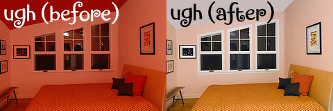
And this was after a heavy “de-contenting,” including removal of half the pictures from the walls and several additional layers of mismatched bedding: what I referred to above, as politely as I could, as “a little bit of tinkering here and there.” A little bit of tinkering, indeed.
Anyway. Back to the Carderock Springs assignment for Doug Soe Lin. With Soe Lin’s encouragement, and a willing homeowner (so key, so SO key…), we took control over the job site and crafted a scene that evoked an interior design sensibility that was properly aligned with the architect’s design intent. No college dorm furniture. No poodles.
Since that 2007 shoot in Carderock Springs, asserting control over the job site has become an increasingly important part of my job. It involves a frank and honest discussion between the photographer, the architect and the homeowner; a fair amount of advanced planning and legwork; and more than a little bit of elbow grease on the day of the shoot.
These days, I go well beyond moving found objects around in the home. Rarely now do I leave my studio without at least a couple boxes of my own props tucked into the back of my trusty Saab wagon, crowded together with the light kits, camera bags and ladders. Sometimes, I use one of my favorite objects to kick a scene up a notch or two (a vase, a chair, a framed photograph or painting). Other times, I practically take the place over and fill a scene with things the homeowner has never seen before, and will never see again. And often, after scouting an assignment, I find the need to do a little extra legwork to procure items from friends and friendly vendors that are needed to develop a scene to its full potential.
I guess this is actually something very simple. It’s called staging. Any architectural and interior photographer worth his weight in poodle food does it, or better yet, hires someone to do it for him.
My biggest challenge, though, as I stated originally in my little 2010 essay, is being able to offer this highly specialized skill to my often cash-strapped small-firm clients without spending too much time on it and either billing them (gulp) or not billing them (sigh). I’m still working on figuring out how to strike that balance, and I thank my clients for their patience and indulgence.
I think, nowadays, though, we all agree to agree that our work together is turning out much better than it did in 2006.
My friendship with two best supporting actors
— Posted on 11 November 2013 | 4:10 am
So on this lovely Sunday evening, I’m thinking about the legendary Julius Shulman, my mentor and my inspiration.
But I’m not really thinking about Julius the legend, or Julius the mentor, or even Julius the inspiration.
Julius the legend is someone you admire; whose work you think is awesome; whose books you read; whose name you drop around architects, other photographers, and mid-century buffs. Julius the mentor is someone you met a couple times who told stories and proffered advice; someone whose work you study and draw lessons from; someone whose work yours might even resemble in rare peak moments. And Julius the inspiration is an abstract thing that drives you to work hard, think about your work a certain way, aspire to return to Los Angeles once a year or so to recharge the battery.
And while I do think of Shulman in those ways, there is an altogether different way that he crosses my mind, when I get into a certain mood on a Sunday night, or any night for that matter, or sometimes just on some random sunny afternoon.
It’s family.
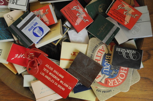
As someone who’s met Julius a few times, including twice or three times at his home in the Hollywood Hills, I shouldn’t claim to be someone who “knows” him particularly well. Yet, I feel like I do know him, and I do have real love for him. This, I owe solely to his daughter, Judy McKee.
You see, wherever Julius went, so went Judy. And early on in my brief relationship with Julius – when I was waiting in lines to meet him at various book signings and lectures – for every minute I got with Julius, I got 10 or 20 with Judy. Everyone did.
Judy is about the same age as my dad’s middle sister, Christie, and she has the same spark as Christie: an intellectual curiosity, an emotional intelligence, a sense of duty and empathy for generations both above and below her.
When you got face time with Judy McKee at an event, you would get the sense that you could talk to her anytime, about anything. In fact, you could. Both she and Julius encouraged people to reach out and get in touch with them. But where Julius would say, “Whenever you’re in LA, just look me up – I’m in the book,” Judy would gracefully give you her contact information – an email address and a telephone number – both of which would never go unanswered.
But more than simply running interference for her dad with fans and admirers, Judy extended her friendship with an unexpected warmth and genuineness. In the years following my first encounter with Julius and Judy at the National Building Museum in Washington DC, I would do both: call Julius’s land-line on my cell phone from the driver’s seat of a rental car in L.A. to set up times to come see him; and call and email directly with Judy from afar.
Judy struggled with the decline and passing of her father Julius a few short years before our family was forced to deal with the passing of Christie’s dad – my grandfather, Ken. Julius and Ken didn’t have much in common, other than their age, but Judy and Christie were, and are, similar in a lot of ways, I think.
They both shouldered outsized burdens related to the care of their respective fathers. Judy managed Julius’s schedule and financial and legal affairs, and she monitored his physical and mental condition, protecting him from both outside forces and from his own tendency to overachieve, even in his mid- and late-90s. But because he was such a forceful personality and remained in full control of his faculties until so nearly the end, Judy would always play a supporting role. He owned the spotlight.
Aunt Christie, living less than a mile from my grandparents, has become their default financial and legal gatekeeper, as well as their wellbeing-watcher and taxi driver. When my grandfather died last year at age 97, it was (believe it or not) somewhat unexpected, as he was in stronger physical and mental shape than my grandmother, and had been taking care of her for a number of years. (She improved after Grandpa died and is still alive and well, now 97 years old herself.)
One day not long after Grandpa died, Christie and I had a beautiful conversation about how invincible we all thought he was, which gave us a false sense of security that he would always be there: the patriarch, the leader of the family. We were all children, and would always be.
That day, Christie told me that his passing left her feeling like a 60-something orphan. He was always supposed to be there, taking care of everything, and now he wasn’t. He was simply gone.

Having gotten to know Judy McKee, and having corresponded with her a couple years back about the passing of her own father, I related very much to Christie’s confession. I thought about Judy through that conversation with Christie and afterwards. They shared something as 60-something daughters whose invincible 90-something dads had just disappeared from their daily lives.
* * *
In a context that would normally be characterized by fans and admirers tripping and falling all over a harried and dismissive LA celebrity, Judy McKee and Julius Shulman instead offered friendship to those who were willing to take it.
I have no doubt that scores of people grabbed onto Shulman’s offer of friendship and used it for whatever purposes suited them: namedropping and great party stories; quest for knowledge and insight from a true legend; or maybe just conversation about pretty girls over a good glass of scotch.
I don’t know how many people, though, grabbed onto Judy McKee’s offer of friendship and made it The Main Act rather than treating it simply as a necessary step to gain access to The Legend She Guarded. But I did, because she has that spark of intellectual curiosity and emotional intelligence that feels so much like my Aunt Christie. Both friendships mean a lot to me.

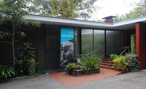
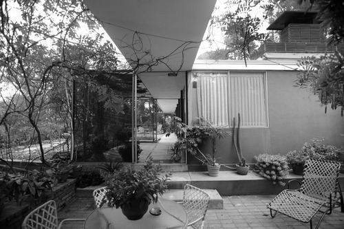
After Julius died in 2009, Judy was kind enough to allow me to photograph his home (designed by Raphael Soriano and completed in 1950), although only after the family had taken the time to process their loss and remove the most important and meaningful items from the home.
No other photographer had ever been given such access to the house. It was a profound honor and remains the highlight of my own life as a photographer.
Not so much because I got to photograph “the Shulman house,” but because Judy allowed me to photograph Julius’s home.
The house has since been sold to a young couple who are updating it sensitively, being careful to honor the home’s history out of respect for its architectural pedigree and its legendary original owner. It is my hope to get back to Woodrow Wilson Drive to revisit the home, have a conversation with the new owners over a glass of scotch about, well, let’s say pretty buildings, and perhaps take a few post-renovation photographs for posterity.
what's in a crop?
— Posted on 5 November 2013 | 1:36 am
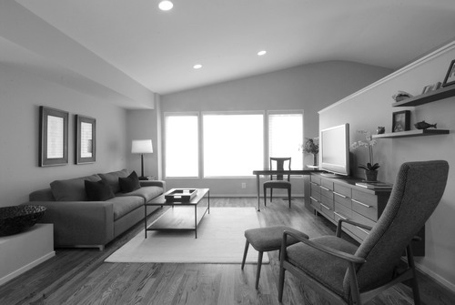
As an architecture and interiors photographer whose client base, by choice, is dominated by small firms, many comprised of only two or three people, my biggest challenge is to generate top-quality images out of shoots that are often under both time and budget pressures.
I would love to be able to spend several hours studying a particular scene, taking a variety of test shots to validate or invalidate a particular composition, and tweaking the lighting and staging until it’s perfect.
But time is money, for both me and my client, which means I usually don’t have the luxury of taking that much time to execute a shoot. I have to be swift in my decision-making, on both composition and lighting. And I often end up shooting more scenes “as-found,” rather than being able to set the scenes up to my liking, or more specifically, being able to tweak a scene until it is to the camera's liking, a process that is very iterative and can be quite time-consuming.
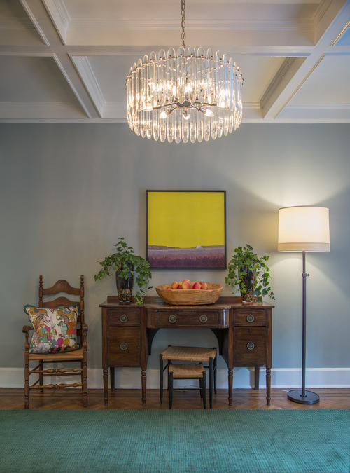
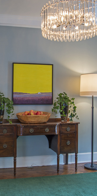
I found myself in this situation last week at a dining room shoot in the home of an interior designer, longtime client Annie Elliott of bossy color. One photograph was meant to show both the dining room table and chairs, and the hutch behind it on the wall, flanked by a chair on one side and a floor lamp on the other. This scene naturally contained a certain amount of depth, and was made all the more interesting by the designer’s tendency to juxtapose traditional and modern elements in her designs.
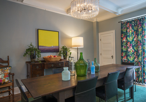
But once the wider view was a wrap, we moved on to a much more challenging view. The designer wanted to highlight the wall composition (hutch with chair and lamp) in a stand-alone photograph. We moved the dining table and chairs out of the way and set up the camera, shooting straight on. We tweaked the position of the chair and nudged the pillow a bit here, then a bit there. We put some cane nesting stools under the hutch to fill what we thought was a void. Better. But still. Hm.
Finally, we moved the camera so that we were shooting at a slight angle, rather than straight at the wall. Better because there was a certain diagonal tension in the scene that was missing from the earlier perspective, but weaker because the image seemed to be turning out even flatter than before: various pieces of furniture and accessories simply lined up along a wall. It didn’t look as warm and comfortable in the photos as it felt in person.
We moved on to the next shot. I had a funny feeling that the scene wouldn’t end up being one of the stronger shots of the day; one that would find itself on her website, or mine for that matter. We had more work to do, and the light was fading. Plus, her twin daughters had returned from school, and we were losing some of our coveted “control of the job site.” Homework was calling. Halloween candy needed to be guarded. (This was October 29th, after all.)
We made it through two more scenes before calling it a night, the dining room wall vignette a likely casualty of the time and budget constraints of the job.
A funny thing happened, though, in post-production. Having produced several other views of the room that, in the aggregate, showed everything in this scene - including the beautiful turn-of-the-century beamed ceiling, the side chair with its punchy pillow, and the contrarian modern floor lamp and chandelier - I made a decision to cut some key elements out of the scene and simplify the photograph: Out of a wide vignette, I made a narrow vignette.
And, in my opinion, it transformed the photo from an also-ran to one of my favorite images from the whole day.
There are two key elements in this crop that, on reflection, I believe resulted in a much more successful composition than the original capture. (I try to apply these elements in the field as I’m taking photographs, but sometimes it ends up playing out during post-production edits).
One: Even when there are several if not many wonderful things to show in a scene, it is not necessary to show them all in every view of that scene. We already have a great photo of the elegant beamed ceiling; and a different great photo of the side chair with the wonderful, whimsical pillow on it; and yet another showing the mod chandelier in its glorious entirety with its vertical patterned crystals, radial light element and chrome hardware.
But this scene was meant to be a vignette. Definition 4 in the Random House dictionary: “Any small, pleasing picture or view.”
Second, a photograph often becomes stronger when you leave it to the viewer to complete the scene in their mind, rather than showing all objects in their entirety. This is particularly true if showing an object in its entirety in one quadrant of the photograph leaves some kind of blank space or imbalance in another quadrant of the photograph.
In this case, trying to capture the whole chandelier up top and the chair at left threw the balance of the photograph off in two ways, with the hundred-year-old ceiling drawing unnecessary attention from the interior designer’s composition and the chair at far left leaving a somewhat blank spot on the wall above it when viewed from the camera angle we eventually chose for the photograph.
Furthermore, cropping the left edge of the hutch out of the image made it less literal - less of an object simply being documented - and transformed it into a visual rendering of a design decision made by a creative and original designer. When the viewer completes the object in their mind, they participate in the design process; the photograph makes this happen.
This crop was classic addition by subtraction; ironically, a process quite often found in the design task itself, with similar results: a vastly improved end product.
Kenneth L. Wilkinson, photographer.
— Posted on 18 October 2013 | 1:57 am
So when my grandfather died in 2012 at the age of 97, I inherited a large box of film negatives. Over 75 years of photographs, a visual record of a long life well lived. I’ve only just begun to scratch the surface of this archive of photographs, which mainly document the passing of time across five generations of our family. Among all the family photos, though, I did find a few photographs that reveal a more artistic and experimental side to my grandfather, tucked among the oldest pieces of film in the box, likely dating to his years as an undergraduate at Penn or early in his adult life.
One negative in particular stood out: what looks to be a poinsettia in a stout, square-shaped art pottery vase, set on a small square table covered in a simple white sheet. I put the negative on the countertop, grabbed my iPhone, and photographed the emulsion side of the negative, which in the glare of the kitchen lights actually reversed from a negative back into a positive. Threw it into instagram and *poof* here you go.
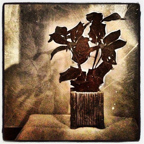
With great admiration, respect and love, I publish this photograph of a negative of a photograph taken by Kenneth L. Wilkinson, appx. 1936.
at last: a new website
— Posted on 17 October 2013 | 3:44 pm
I’ve been retelling the old story for half a decade now about the cobbler whose children have no shoes. I’ve needed a new website to display my photographic, marketing strategy and web development work for a long time.
Finally, I’ve launched one.
Ironically, the new website makes virtually no mention of the work that I do for architects and developers to help them put their own work on the web.
You see, many of my architectural photography clients also engage me to develop their websites and carry out other marketing strategy and communication tasks.
In spite of the many benefits of working in the fertile web development space, though, I’ve made a decision to use my website mainly as a platform to display my work as a photographer, and to downplay the web development aspect of my consulting practice.
Truth is, my web development clients actually benefit from the fact that web development is not my primary focus. It means that I don’t have a weeks- or months-long queue of client work in front of any request they may have. They call, and most often, I can knock out their request within a day or two.
So the fact remains that, as cobblers, MKW the photographer has finally given his children some new shoes while MKW the marketing strategy consultant and web developer is still holding back, making his children walk to school barefoot, uphill both ways, in the snow, etc.
For what it’s worth after taking pains to explain that I shall not emphasize my web development work on this website, I offer links to two of my favorite full “wrap-around” clients:
And with that, this little pitch for my web development work:
Launching a new website involves many tasks: developing a look and feel for the site; developing a “voice” for the firm that is found in the site copy; developing a content strategy and navigation scheme (who’s your audience, what do you want to say to them, and how is the information best presented?); building the site structure; then filling in all of the content (photographs and copy). And beyond that, keeping it fresh with updates.
Many of my clients, being small business owners, have very little spare time to do any of this themselves, particularly the final stage where most web developers look to the client for content: selecting photographs and writing the copy for the site.
Here, I think, is where I bring greatest value to my clients. I’m not just your photographer; I’m also your web developer. And as your web developer, I’m not just an implementer; I’m also your content creator. Because I’ve photographed your work, I know it pretty well and because I love residential architecture, I can write about it with skill and passion, choosing the right words to describe the work artfully but concisely. All in that “voice” we created during the development phase of the project.
I’m a one-stop shop. We never need to put the project on the back burner while I “wait for the client to send copy and artwork.”
It saves my clients an enormous amount of time. Which brings peace of mind to busy, busy, busy business owners.
Makes me wonder: Where was I when I needed me? Welcome to my new website. Finally.